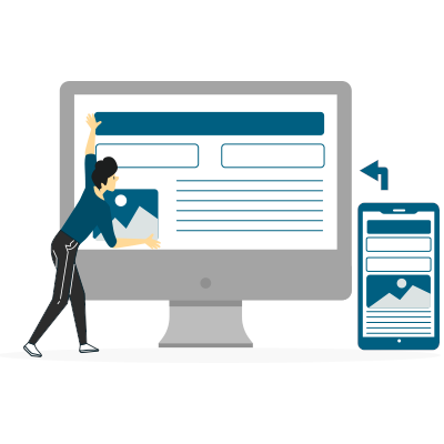
In 2025, ensuring your website looks and functions flawlessly across multiple devices is essential. Responsive design, which adapts your website’s layout to different screen sizes, is no longer a luxury but a necessity. CSS Flexbox and Grid are powerful layout tools that make achieving responsiveness easier and more efficient than ever before.
Whether you are a beginner or an experienced developer, mastering these tools will help you create visually appealing and well-structured websites.This article, written by the WebsCare team, will guide you through the process of using these technologies to create a truly responsive website.
Looking for expert web development services? Get in touch with us today!
Why is Responsive Web Design Important?
Responsive Web Design is crucial because it ensures a seamless user experience across all devices, including desktops, tablets, and smartphones. It improves navigation, readability, and load times, reducing bounce rates and increasing engagement. Since Google prioritizes mobile-friendly websites, RWD also enhances SEO performance, helping websites rank higher in search results.
With the rise in mobile traffic, a responsive design ensures accessibility and consistency, leading to higher conversion rates and customer trust. Plus, it is cost-effective, eliminating the need for separate mobile and desktop sites while future-proofing the website for evolving screen sizes and devices.

A Brief History of Responsive Web Design
Before RWD, websites were primarily designed for desktops, leading to poor user experiences on smaller screens. Early solutions involved creating separate mobile sites, but this approach was costly and inefficient.
The term “Responsive Web Design” was first introduced by Ethan Marcotte in his 2010 article on A List Apart. He proposed a flexible, fluid grid system, scalable images, and CSS media queries to create adaptable websites. As mobile browsing surged, his ideas gained rapid adoption. By 2015, Google made mobile-friendliness a ranking factor, reinforcing the importance of RWD. Today, responsive design is standard practice, ensuring optimal user experience across all screen sizes while improving SEO, accessibility, and performance.

Understanding the Basics: Flexbox vs. Grid
Before diving into implementation, it is important to understand the strengths of each technology
| Feature | Flexbox | Grid |
|---|---|---|
| Layout Type | One-dimensional (row or column) | Two-dimensional (rows and columns) |
| Best For | Navigation menus, aligning items in a container | Overall page layouts, multi-column designs |
| Alignment | Distributes space between items efficiently | Defines size and position of elements within a grid |
| Complexity | Easier for small layouts | Ideal for complex website structures |
Curious about how web development is shaping Pakistan’s digital future? Let’s read more about it.
Flexbox Example (Aligning Items in a Row)
Flexbox is ideal for creating responsive layouts by aligning items in a row, distributing space efficiently, and maintaining flexibility across different screen sizes.
<!DOCTYPE html>
<html lang="en">
<head>
    <meta charset="UTF-8">
    <meta name="viewport" content="width=device-width, initial-scale=1.0">
    <title>Flexbox Example</title>
    <style>
        .container {
            display: flex;
            justify-content: space-between;
            background-color: lightgray;
            padding: 10px;
        }
        .item {
            background-color: steelblue;
            color: white;
            padding: 20px;
            margin: 5px;
        }
    </style>
</head>
<body>
    <div class="container">
        <div class="item">Item 1</div>
        <div class="item">Item 2</div>
        <div class="item">Item 3</div>
    </div>
</body>
</html>
Grid Example (Creating a Basic Layout with Rows and Columns)
Grid is perfect for building structured layouts by defining rows and columns, allowing precise control over element placement and alignment within a container.
<!DOCTYPE html>
<html lang="en">
<head>
    <meta charset="UTF-8">
    <meta name="viewport" content="width=device-width, initial-scale=1.0">
    <title>CSS Grid Example</title>
    <style>
        .grid-container {
            display: grid;
            grid-template-columns: 1fr 2fr;
            grid-template-rows: auto;
            gap: 10px;
            background-color: lightgray;
            padding: 10px;
        }
        .grid-item {
            background-color: steelblue;
            color: white;
            padding: 20px;
            text-align: center;
        }
    </style>
</head>
<body>
    <div class="grid-container">
        <div class="grid-item">Header</div>
        <div class="grid-item">Main Content</div>
        <div class="grid-item">Sidebar</div>
        <div class="grid-item">Footer</div>
    </div>
</body>
</html>
Flexbox vs. Grid: Choosing the Right Layout System for Efficient Web Design
Understanding the differences between Flexbox and Grid helps in creating responsive and well-structured web layouts.

Flexbox
Flexbox, or the Flexible Box Layout, is designed for one-dimensional layouts, meaning it works either in a row (horizontal) or a column (vertical). It provides a powerful way to distribute space between items within a container, align elements efficiently, and control their order dynamically. Flexbox is particularly useful when designing navigation menus, aligning items inside a card, arranging buttons, or handling dynamic content resizing. With its ability to handle alignment, spacing, and responsiveness effortlessly, Flexbox is ideal for small-scale layouts that require flexibility and adaptability.
Grid
CSS Grid Layout, commonly known as Grid, is built for two-dimensional layouts, managing both rows and columns simultaneously. It allows developers to create complex and structured layouts with precision by defining the size, position, and alignment of elements within a grid container. Grid is highly efficient for full-page layouts, multi-column designs, intricate dashboard structures, and magazine-style arrangements. It offers more control over positioning and spacing compared to Flexbox, making it the preferred choice when working with structured designs and large-scale web layouts.
Key Concepts for Responsive Design
Mastering these fundamental concepts ensures a seamless and adaptable user experience across various screen sizes.
| Concept | Description | Use Case |
|---|---|---|
| Fluid Layouts | Uses relative units (%, em, rem) instead of fixed units (px) for flexibility. | Ensures content adapts to different screen sizes. |
| Media Queries | CSS rules that apply styles based on screen width, height, or device type. | Adjusts layouts for mobile, tablet, and desktop views. |
| Flexible Images | Images resize automatically based on the container’s width. | Prevents images from overflowing or distorting. |
| Viewport Meta Tag | Controls how a webpage is displayed on different devices. | Ensures proper scaling on mobile screens. |
| Mobile-First Design | Starts designing for smaller screens first, then scales up for larger ones. | Improves performance and usability on mobile devices. |
| Grid & Flexbox | Layout techniques for structuring responsive web pages. | Creates flexible and organized page structures. |
Searching for the best web development tools? Let’s find the top 8 tools to optimize your workflow and enhance productivity!
Conclusion
CSS Flexbox and Grid are essential tools for designing responsive and dynamic web layouts. Flexbox is ideal for one-dimensional layouts, allowing for efficient alignment, spacing, and distribution of elements within a container, making it perfect for navigation bars, cards, and component-based structures. On the other hand, CSS Grid excels at two-dimensional layouts, enabling precise control over both rows and columns, making it the preferred choice for complex page structures, multi-column designs, and entire website layouts. By leveraging the strengths of both Flexbox and Grid and incorporating media queries, developers can create adaptive and visually appealing websites that offer a seamless and consistent user experience across all screen sizes and devices.


